Go go gadget gauges
2008-03-25
Google have released some new toys: visualizations AKA gadgets.
This is what we've been waiting for without quite knowing what we were waiting for.
If you have some data in a Google spreadsheet, or another application that implements the API (are there any?) then you can hook it up to a visualization. See the gallery.
This was not available when I looked at graphing just a couple of months ago, although maybe I could have done something with Google spreadsheet charts.
I thought I'd see how easy it would be to build a new web service. Imagine if I wanted to add a 'rate this post' function to my blog. (I don't, but I might want something along those lines for document collaboration. I've talked before about the potential for a dashboard for documents.)
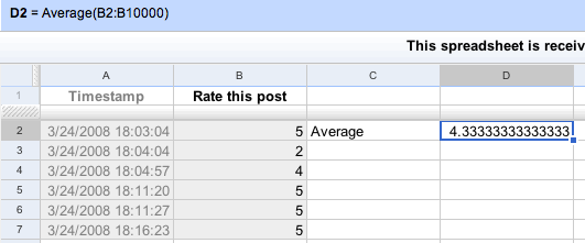
So, I went to Google and made a blank spreadsheet. From there I was able
to make a form (via Share) with a simple multiple choice where you can
rate this post 1,2,3,4 or 5. I grabbed the form and pasted saved it, and
embedded in this post. Once I worked out where the form values were
being saved it was simple to add a cell that calculated an average
rating. Not worrying about rounding or precision or niceties like that
at this stage.
So here's the form, in this table:
+--------------------------------------+--------------------------------------+ |
| | +--------------------------------------+--------------------------------------+On the right is a simple gauge-style visualization, which shows the average rating from 1 to 5. I have rated the post pretty highly to start off with, so if you'd like to see the needle move you'd better vote several times with low numbers. I won't be offended. Note that it seems to cache results so you won't get a new view every time you refresh.
Ok, so this instance is a trivial toy, but it opens up a whole lot of new possibilities. Can't wait to see what Jim Downing does; “I want to play”, says he via del.icio.us. There's great potential here not just to make visualizations that plug into Google Spreadsheets, but to use the same APIs and/or general approach to do the same for research repositories. The repository community needs to respond quickly to this, lest important research data ends up being hosted in personal Google accounts outside of any preservation regime.
We're doing a demo tomorrow with a mockup of an assignment submission / marking system using the same technology. Faculty, do not try this at home.