Graphing with ICE
2008-01-04
Peter Murray Rust followed up my post on publishing interactive maps, with a post about graphing.
XY graphs are so common and so important that we ought to be able to cut and paste them, preserving he semantics of the underlying data. One of my New Year WIBNIs. [Link added by ptsefton as I had to look up WIBNI]
As I said in the last post, what I'm trying to do, with the help of the ICE team is to find ways for people to publish both data and visualizations of the data, preferably interactively.
Why?
Well an example is; in my last post there was an anomaly in the data, or the graph of the data. I'm not sure which, but it should be possible for people to find out, because the data is all out there in the open. More on that later.
Inspired by Peter's WIBNI, I've been poking around the web this morning to see what graphing tools are out there for HTML, and found the modestly titled Definitive guide to charts and graphs which surveys methods of embedding graphs in HTML.
I'm still thinking about the possibilities, but here are a few quick experiments with graphing, using OpenOffice.org Writer (NeoOffice) and the ICE system. As you will see, this post is far from a definitive guide.
Google Chart API
First up, I explored the Google Chart API. As it says on the site, The Google Chart API lets you dynamically generate charts using a URL. All the data are encoded in the URL itself, which makes copying and pasting really easy, but you would need to find the API document to decode the data.
Here's an attempt to reproduce one of the diagrams we use to explain ICE. The Google Chart API will only let me have three circles so it doesn't really work in this case.
+--------------------------------------+--------------------------------------+ | Original diagram | Google Chart version | +--------------------------------------+--------------------------------------+ | <span | <span | | style="display: block"><a name="grap | style="display: block">[[graphics3] | | hics2">[graphics2](/wp-content/ | (/wp-content/uploads/2008/01/34acf69 | | uploads/2008/01/m56e8260bs268x2686.j | fs267x1336.jpeg)](http://chart.apis. | | peg) | google.com/chart?cht=v&chs=200x100&c | | | hd=t:80,80,80,30,30,30,10&chdl=XHTML | | | %7CWord%7COpenDocument)[Follo | | | w | | | the link to see the chart direct | | | from google's | | | API.](http://chart.apis.google.com/c | | | hart?cht=v&chs=200x100&chd=t:80,80,8 | | | 0,30,30,30,10&chdl=XHTML) | +--------------------------------------+--------------------------------------+
Here's another chart showing the average rainfall for Toowoomba in mm, using data that I downloaded from the Bureau of Meteorology in CSV Format. To use the data I converted it to a percentage of 150mm – hope I got it right.
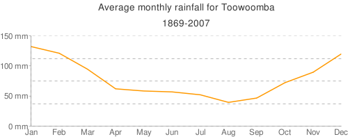
Follow the link on the picture to see the data encoded in a URL– but there has been some data loss because of the requirement to encode the data for the Google Chart API.
Flot
Next I tried Flot(found via a comment on PMR's post).
Flot is a Javascript solution. I took one of the examples from the site and played with the data until I got this, which has some rudimentary interactivity – you can click to see the x and y values for the spot you clicked on, not that useful at present, but it should be possible to make it much more useful with a bit of work.
To make this work I used the same technique I wrote about for maps. I put a copy of the Flot HTML page on my server, took a screenshot, pasted it in here and [linked it](http://ptsefton.com/tmb-rainfall.html) to the HTML. ICE used the HTML for online use and the image for print/PDF.[Update: Fixed! WP has this bizarre feature that adds paragraph tags to your code when it renders a page, even in the middle of a script. I turned it off using a plugin called Disable WPAUTOP.]
Chart tool in Writer
Finally, I did the obvious thing and tried the OpenOffice.org Chart
tool. This was by far the quickest and easiest way to go. I put the data
into a table, clicked Insert, Object, Chart and I was away. It's
not interactive for the end user, but I can click on it to change
the chart, as could you if I gave you access to my source document or
exposed the chart as a download that you could play with in an
OpenDocument aware application.
Raw data
+--------------------------------------+--------------------------------------+ | Jan | Feb | +--------------------------------------+--------------------------------------+ | 132.1 | 121.1 | +--------------------------------------+--------------------------------------+
And the winner is?
As far as I can see, word processing users are reasonably well served with tools for making static charts. The point-n-click wizards in Microsoft Office and OpenOffice.org are hard to beat for usability. The best thing to do now is probably to expose the data so that others can graph it themselves. There's no way that most authors will want to use something like Flot or the Google Chart API until there are wizard tools to let them point at a table of data and graph it with a few clicks.
None of the solutions I looked at today that are close to meeting Peter's requirement; XY graphs are so common and so important that we ought to be able to cut and paste them, preserving he semantics of the underlying data:
-
The Google Chart API format is cute – and it's very copy-and-pastable, but it:
-
Is very painful to use.
-
Does not work with raw data – you have to encode the data, thus loosing its integrity.
-
-
Flot is also cute, but is also a pain to use, and copying and pasting is out of the question at present as the data are embedded in Javascript in an array.
-
The office-suite based solution is sub-optimal because it's not a web format but it seems to be the best compromise at present.
For options 1 and 2 above it wouldn't be too hard, though, to write some code to pull data from a table in your document, and slap on an easy to use front-end.
Of course this was a survey of ad hoc charting tools – there's lots of scope to automate things where people are using the same kind of data over and over again. If, for example you wanted to deal with rainfall data a lot you could set up an automated process to take the data and turn into an Google Chart API URL or a Flot chart.
(I have left in one deliberate error I made with the data for keen readers to discover - I wonder how many accidental errors there are though?)