ICE Mashups, part one, take two
2008-01-03
[Update 2008-01-03 – fixed a technical issue]
I showed my recent post on embedding maps into blog posts to my long-suffering partner.
She said that while the embedded Google map was cool, the explanation was incomprehensible to her. Me, I would prefer that even if some of the technical detail went over her head that she at least got the point, which apparently she didn't, on account of it was, well, incomprehensible.
(And then she went on to read a few more posts and pointed out some really bad sentences that I had written in the recent past. I think it's my eyes that are causing the problem; they don't focus on text like they used to, but it could well be my brain.)
Here's another try at the same post with the word processor zoomed in to 150% so I can see what I'm typing.
<
Which shows you this:
(Note: I think there's something wrong; it shows a very dramatic dip in the ride that I don't remember, around the 26km mark).
<
- The result is a fragment of HTML you can paste into the source of a web page.
- 
So, Ron Ward has extended the existing 'embed' feature in ICE, for embedding stuff like audio and video. To use it I have to do three things:
-
Put the Bikely on-my-site code into a file somewhere that it can be accessed over the web. In the future we're going to make this really easy, so you don't have to think about it, but for now I had to create the file and copy it to my website. (You also need to change the empty
iframetag to contain a blank comment because of a Firefox rendering bug). -
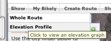
Paste in a screenshot of the image, like this (on the Mac I hit
Cmd Ctrl Shift 4, then selected the area I wanted to capture, and pasted into this document):
- 
-
View the document in ICE, and the HTML version is magically turned into a live map, while the PDF version, which you can't see here, has a static image like the one immediately above.
Now, I know all that is complicated, but eventually we will automate the process so making a map is as easy as uploading the data from the GPS (which is hard enough on its own). ICE will automagically turn a tracklog into a map, and generate the printable version of the image for you. But this will not be a one-off development. There will be a plugin system so programmers can add formatters for lots of different kinds of data.
<![-id5-->Issues
While this process works, it raises some interesting questions, for which I don't have any answers:
-
In a scholarly context, would it be OK for me to edit my GPS log, as I have admitted to doing here? Depending on what the map is for that might be alright, but there are some kinds of data that really should not be edited.
-
If I expose the raw GPS data how do you know whether I have edited it? Would you trust it if it was signed by the GPS device so you could tell if I had tampered with it? Do you trust me not to hack my GPS device? Would you prefer it if I took along a witness? What about if you sent your GPS device with me, with a tamper-proof seal? Do I trust you?
(A quick search GPS units that can sign their data turned up a patent, but it's designed for shopping, not science 1)
-
If I do expose my data, and link off to the the Google map how do I preserve or future-proof my publication? Can I put the data file in my institutional repository? What if it's really big data, like the stuff2 the ARROW team recently added to the Monash repository? What happens when Bikely disappears, or changes its terms of service? (Something like AONS3 should hep here).
-
How can we make the whole process work seamlessly so that working researchers to use it?
These are the kinds of questions the research and higher-education community will be looking at in Australia as part of activities going on around the new Australian National Data Service4 (ANDS).
1 Bradford H Needham and David Cowperthwaite, EP1485842 Intel european software patent - Authenticatable positioning data - Gauss (2003), http://gauss.ffii.org/PatentView/EP1485842 (accessed December 19, 2007).
2 Carlos J. Rosado et al., “A Common Fold Mediates Vertebrate Defense and Bacterial Attack,” Science 317, no. 5844 (September 14, 2007), http://www.sciencemag.org/cgi/content/abstract/317/5844/1548 (accessed December 20, 2007).
3 Curtis et al., “AONS - An obsolescence detection and notification service for Web archives and digital repositories,” New Review in Hypermedia and Multimedia 13, no. 1 (January 2007), http://dx.doi.org/10.1080/13614560701423711 .
4 The ANDS Technical Working Group, Towards the Australian Data Commons. A proposal for an Australian National Data Service (Canberra: Australian Government Department of Science Education and Trainining, 2007), http://www.pfc.org.au/twiki/pub/Main/Data/TowardstheAustralianDataCommons.pdf .